Seeking Human Kindness: Design, Composition, and Sheer Luck in Smartphone Photography
After spending my entire adult working life immersed in the sciences (I’m a veterinarian), I now find myself pursuing the arts in retirement. I’ve always had an appreciation for photography. In fact, a few years ago, after purchasing a Sony DSLR camera, I took a class on digital photography at PhotoManhattan here in New York City. My instructor, Stephanie, was very inspiring, and she planted the photography seed in my brain. Now, as a retiree, it’s become my passion.
Despite taking that photography class, I never did feel entirely at ease with things like apertures, f-stops, shutter speeds, ISO, etc. I understand the concepts, but it never became second nature. Intuitive comfort requires hours of practice with my DSLR camera, and I simply haven’t put in the time. The reason is simple: I don’t like carrying a camera. I dread the thought of lugging lenses and tripods. I don’t like looking like a tourist or being perceived as one by the local residents.
We’ve become a smartphone society. It’s amazing how smartphones have rendered maps, GPS systems, flashlights, newspapers, calendars, alarm clocks, iPods and notepads nearly obsolete. I don’t think cell phone cameras will ever make digital cameras obsolete, but advances in smartphone camera technology now allow everyone to take superb quality photos with a camera that travels with us everywhere, all the time. I’ve chosen to limit my photography and my photo editing solely to the iPhone.
My past iPhone photos were decent quality, but nothing impressive. It didn’t bother me much. The convenience of taking a photo quickly with minimal camera tinkering trumped the mediocre quality. This changed when I traveled to India. A colleague there shared some photos she had taken with her iPhone and I was floored. Her photos were technically stunning – the colors, the focus, the clarity – and were also beautifully conceived and composed. I didn’t know how she did it, but I vowed to myself that I would one day master these same skills. The major camera upgrades in the iPhone 11 Pro and Pro Max was the kick in the butt I needed to propel me into iPhone photography.
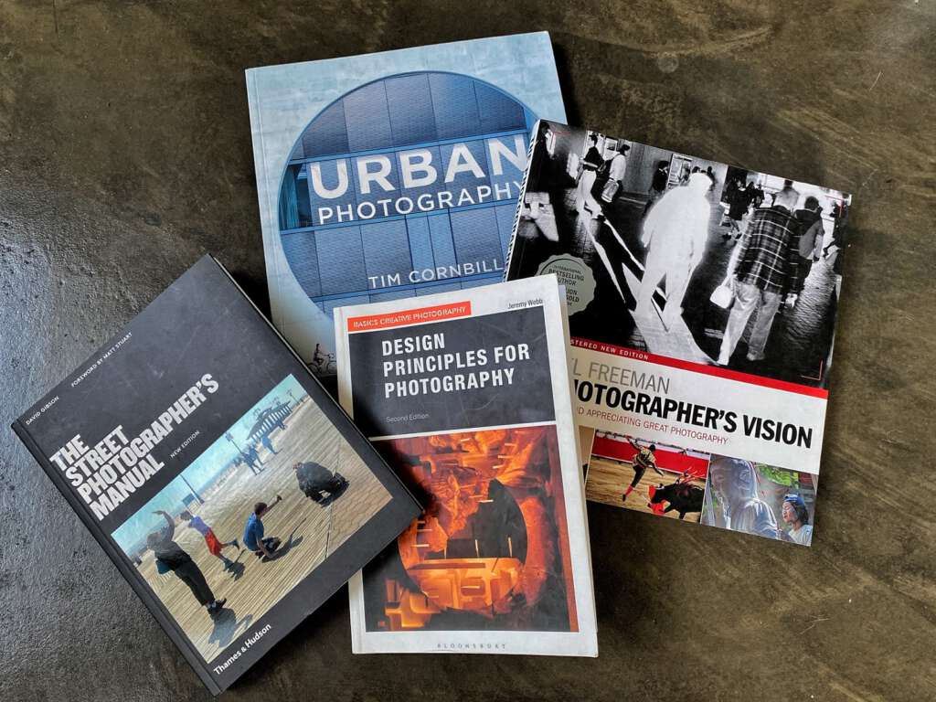
I enrolled in two courses given by the iPhone Photography Academy (one of the best things I’ve ever done), and read several books about photography and technique.
I’m captivated by design and composition in photography. What makes for a striking image? How best to employ line, shape, form, color, and texture to draw the viewer to your photo?
Where to position your subject within the frame for maximum impact? As a beginner, I need to know the rules of good photographic composition. (With most creative fields, the masters are usually the rulebreakers. I hope one day I’ll know the rules well enough to feel comfortable breaking them.)
There are many styles and genres of photography. Although I haven’t committed myself to any particular one, I find myself being naturally drawn to ‘street photography’. Definitions of street photography vary, but in general these are candid photographs of ordinary people, taken in a public space. They capture humanity in moments that are often fleeting. The core, non-negotiable aspect of street photography is that it is never set up.
Although I travel a lot, I live in New York City, and most of my photos are of an urban nature. I enjoy photographing all sorts of people, from window shoppers, skateboarders, and children on the beach, to construction workers, street musicians, and ladies feeding pigeons in the park.
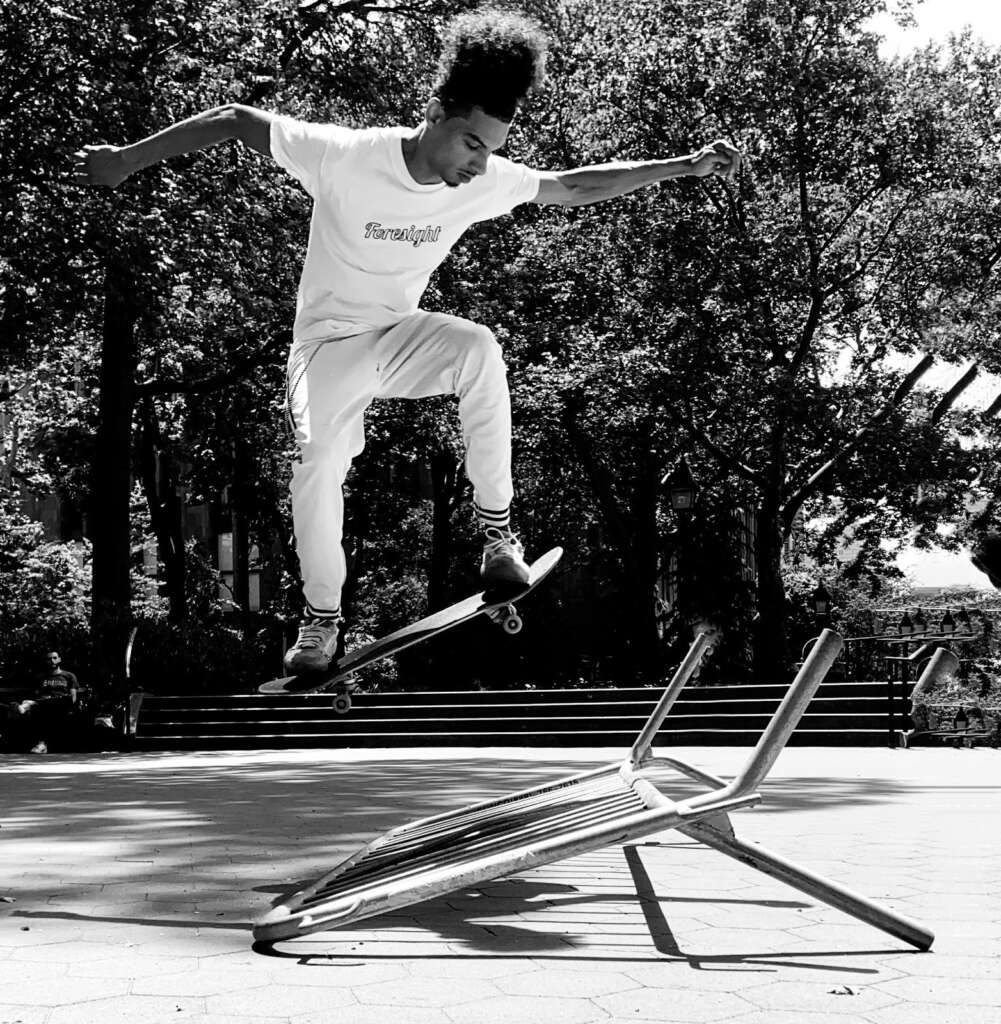
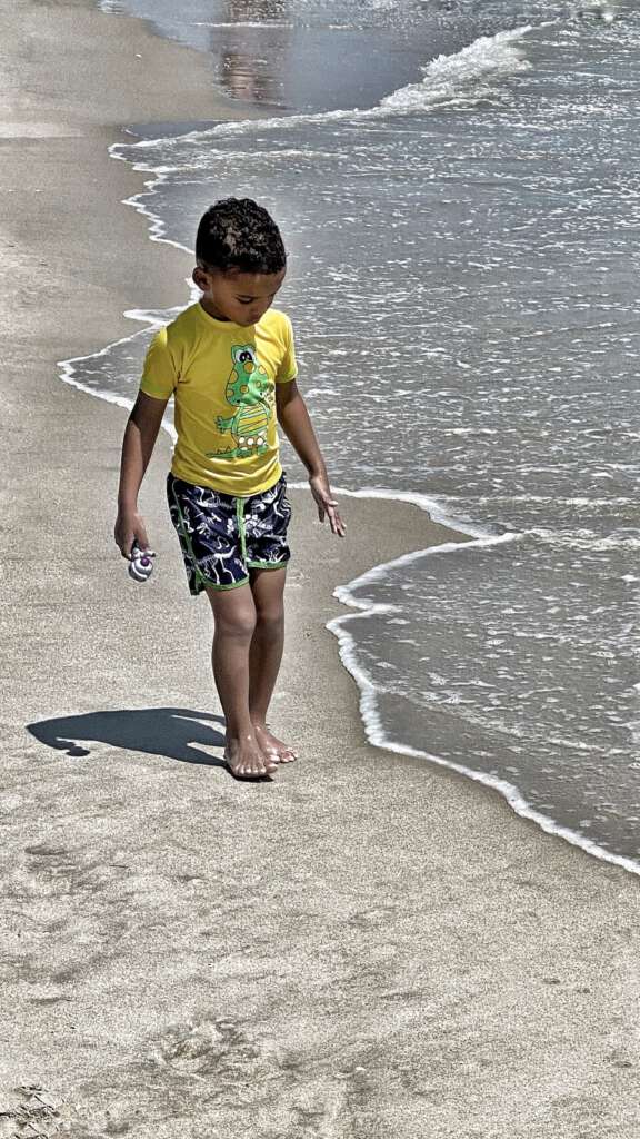
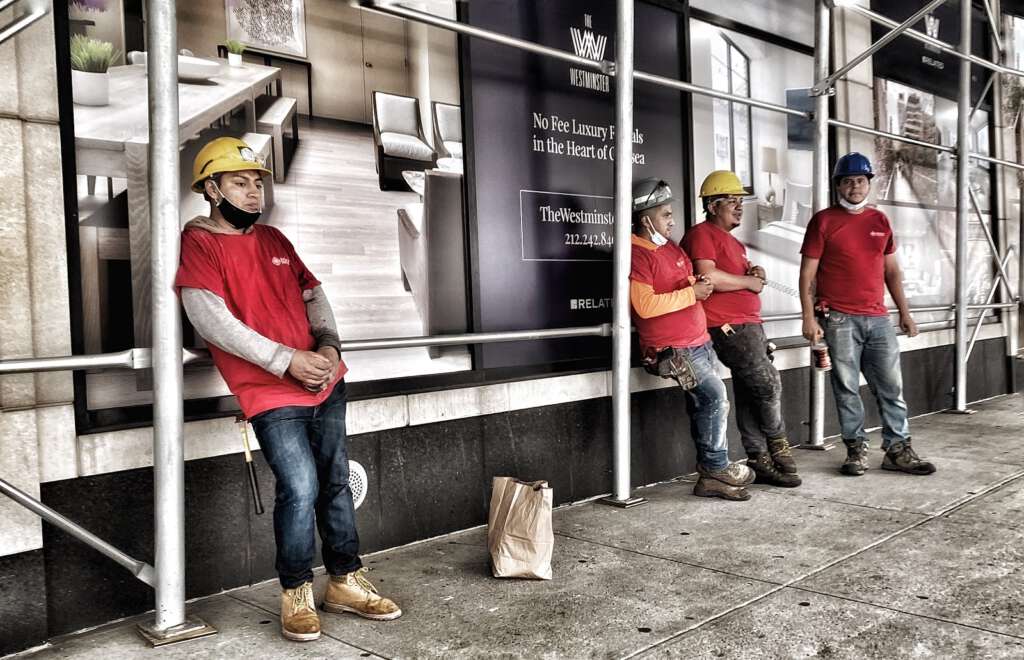
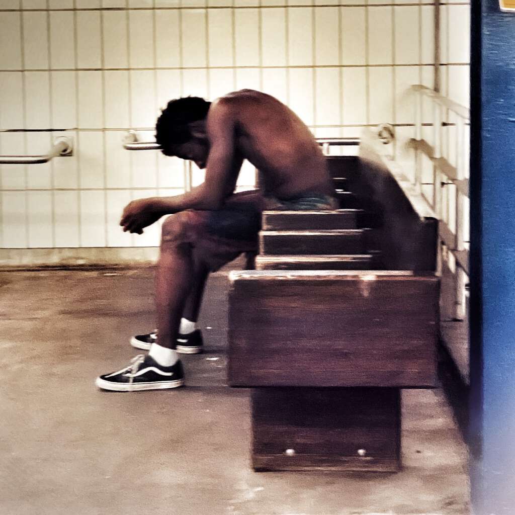
I’m predominantly drawn to people who seem to be down on their luck. I know this is controversial subject matter. I have great empathy for my subjects and am acutely aware of the fine line between compassion and intrusion. I am sensitive to the potential for exploitation. I avoid photographing people whose lives are clearly damaged through mental illness, alcohol, or drugs. Rather, I’m drawn to subjects who have within them what I feel to be a quiet determination and inner strength. Although their life is a struggle, I want to believe that it is temporary, not permanent. I strive to convey this in my photos.
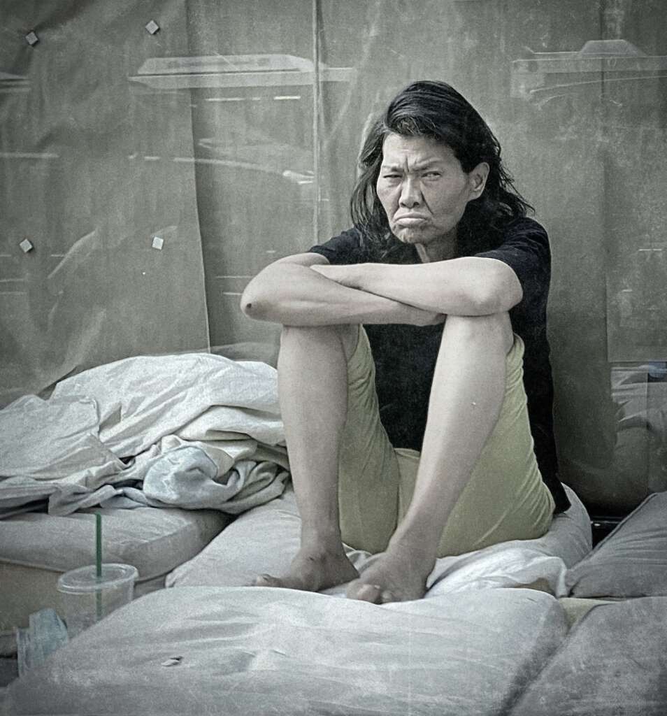
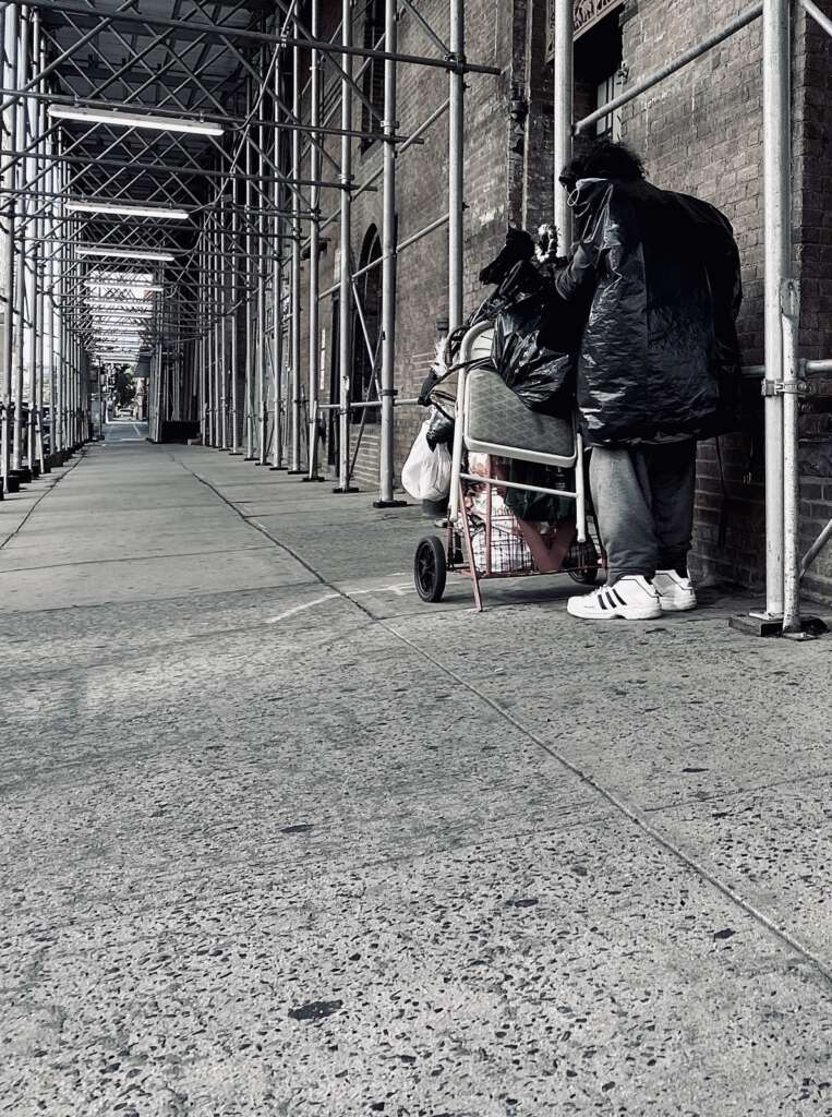
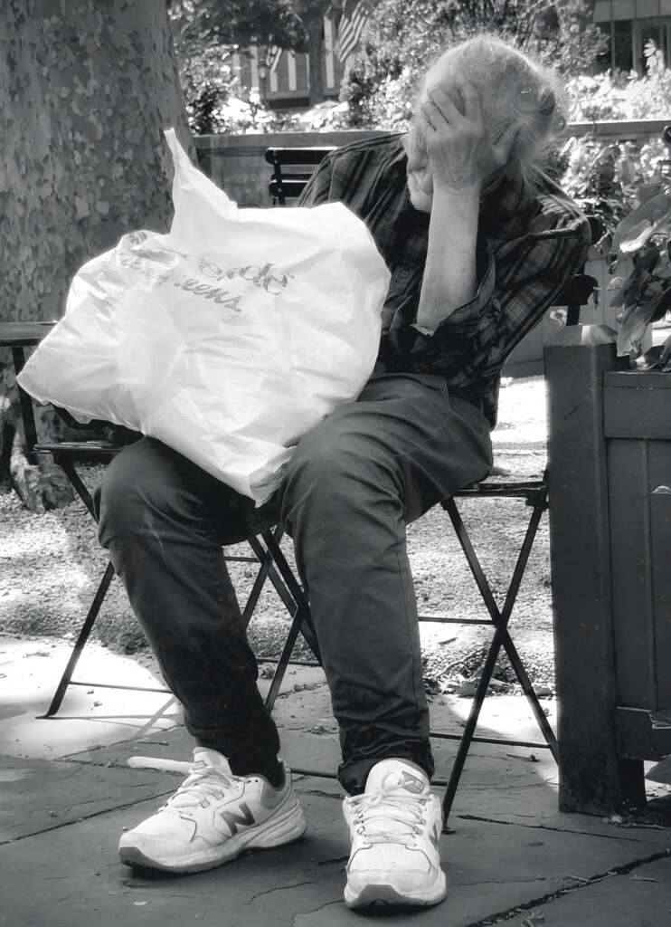
Altering the angle from which a photo is taken is one of the first things I learned about composition. Most people shoot at eye level because that’s the easiest and most comfortable. Shooting at an unconventional angle, however, can reveal your subject in a fresh light.
For example, shooting a person from a low angle can make a person look imposing and powerful. Conversely, shooting from above makes people appear smaller and insignificant. When photographing children, crouching down to their level results in more intimate and compelling portraits.


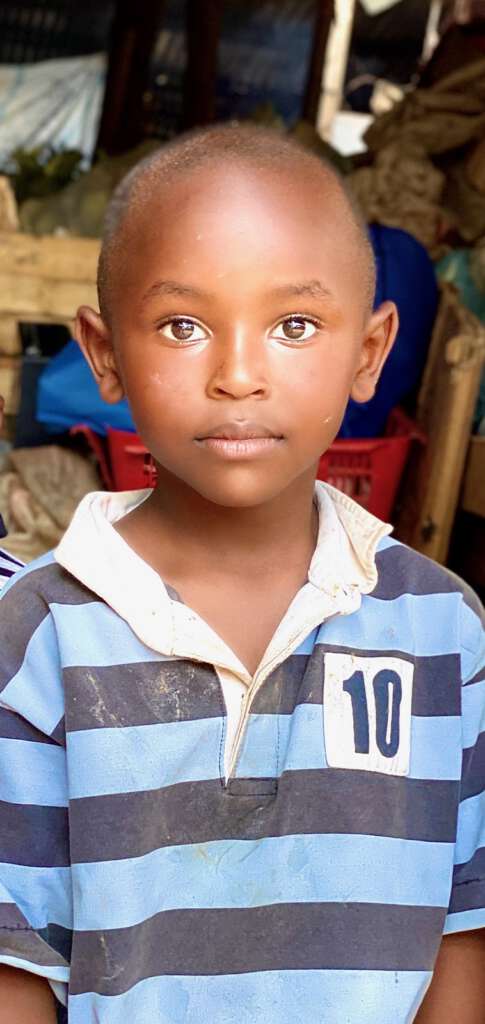
Many of the subjects of my street photographs are sitting or lying on the ground, which presents a challenge.
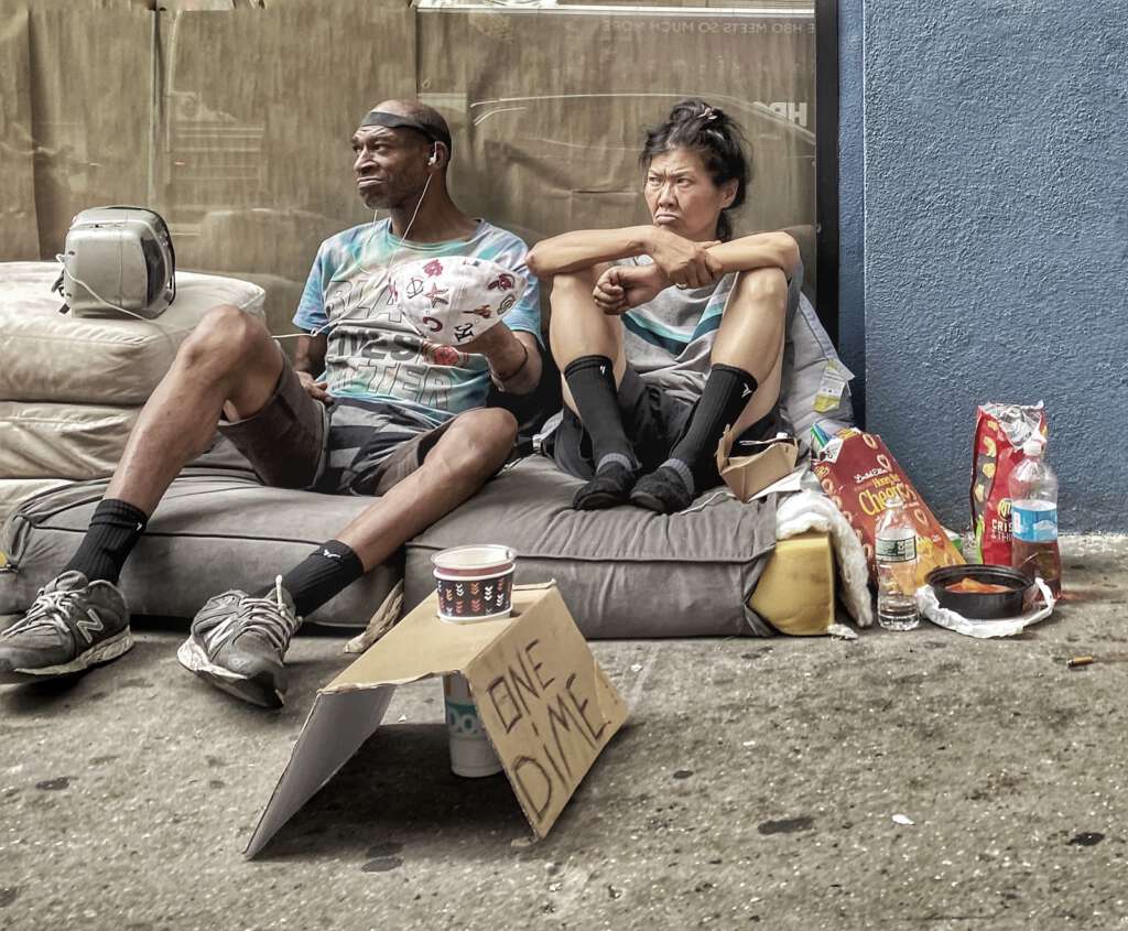
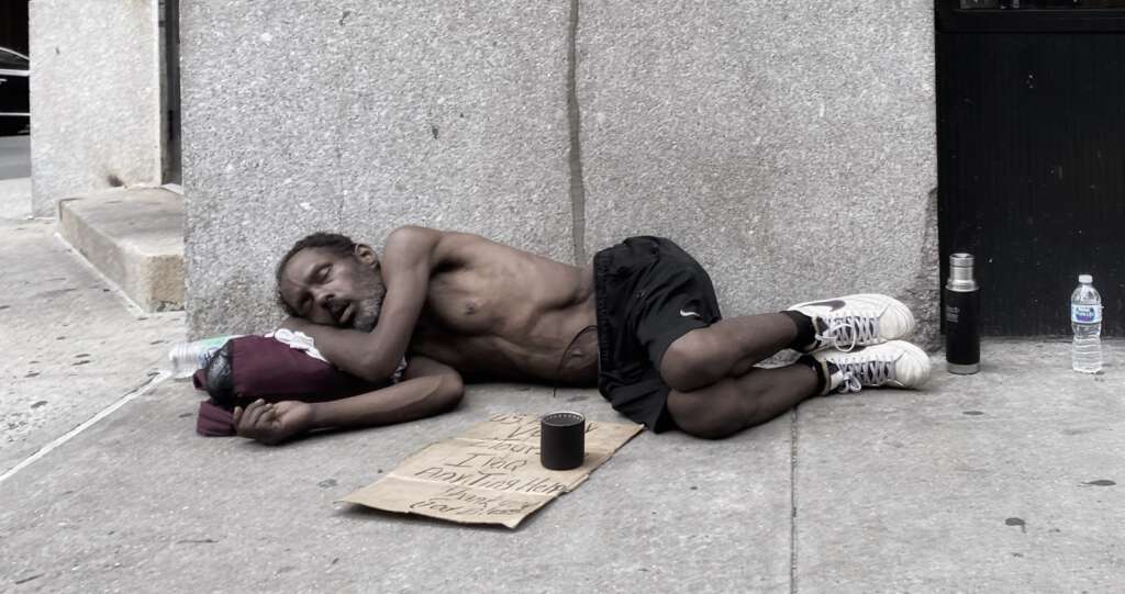
I’ve learned to overcome this obstacle by “shooting from the hip”. This technique involves activating the camera, holding the iPhone at the level of my hip, and firing off two or three shots.
My iPhone 11 Pro has three lens options. The lens I choose depends on the distance between me and my subject. Typically, the person is a few feet away when I walk past them. The ultrawide (0.5x) isn’t appropriate in these situations. In most cases, the wide (1x) works best. When shooting from the hip, I hold the camera as horizontal as possible. As I approach and then pass my subject, I slow my walking pace a little, and with my thumb on either the volume-up or volume-down button, I press two or three times. This activates the shutter. Pressing the button introduces more camera shake than tapping the on-screen shutter, but this isn’t an option here. Although the streets tend to be noisy, I silence my phone before shooting as I do not want to tip off my subjects that they’re being photographed.
I don’t look at the photos immediately after taking them. Later at home, I’ll scan through the hip shots and invariably discover that I’ve timed things poorly and have either missed my subject entirely, or cut them off horizontally and/or vertically.
I don’t check the images right afterward because I don’t feel comfortable trying again, and not just for fear of tipping off my subject. Philosophically, I feel that the appeal of street photography is the unplanned, fleeting nature of the photo opportunity. Retracing my steps to attempt another photo feels rehearsed. It’s no longer candid. If I fail to get the shot, so be it.
As you might imagine, proficiency in shooting from the hip takes practice. Initially, I did it solely with my left hand, but I’ve since become ambidextrous, expanding my possibilities.
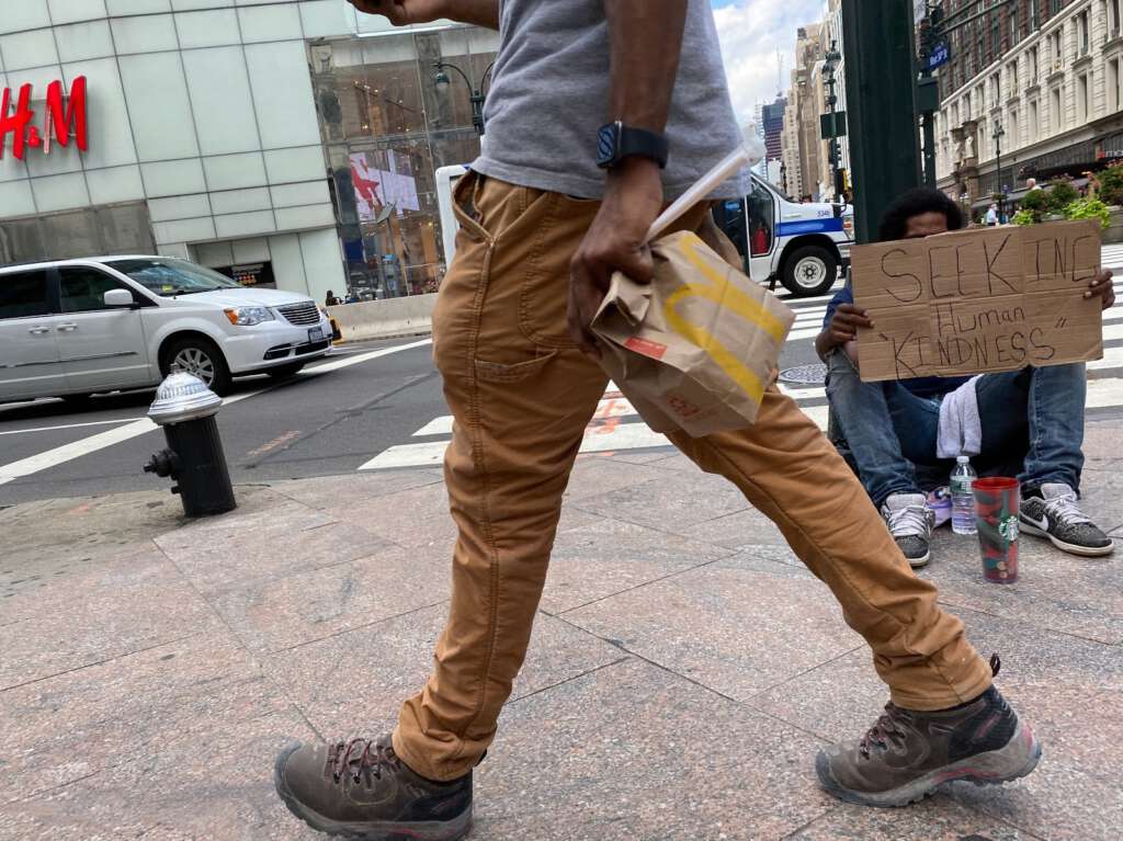
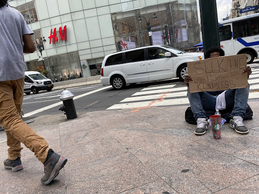
A few days ago, I decided to spend the afternoon reading in lovely Bryant Park. The coronavirus pandemic has closed off many avenues of pleasure – movies, museums, the gym, foreign travel – leaving parks one of my few remaining options. Bryant Park, on West 40th Street, is a 15-minute walk from my apartment on West 29th Street. At West 32st, an active shopping area (Macy’s, Nordstrom, H&M, etc.) populated by all types of people emerges, providing great material for street photographers. At the bustling corner of 6th Avenue and 34th Street, I spotted a man sitting on the ground holding a cardboard sign. He held his sign to deliberately hide his face, and this struck a chord with me. I activated my iPhone camera, held it at my left hip, reduced my walking speed, and took two photos. The results:
Both photos barely managed to capture the seated subject in the frame. I often cut off a sliver of my subject, but this time I got lucky.
In the first photo, the majority of the frame is taken by a guy walking past me. The seated man is still visible. In the second photo, the walking guy has passed; the seated man is still clearly visible. It dawned on me that in the first photo, the guy walking past the seated was a potent metaphor. I would need to do some post-processing to unlock the photo’s potential. This is where my reading about photographic composition begins to reap benefits.
Edit #1: How and what to crop. For this, I relied on a fundamental tenet: The Rule of Thirds. It is undoubtedly the most quoted “rule” of good photographic composition. The idea is that a rectangular frame should be divided into three equal sections horizontally, and then three equal sections vertically, giving the image nine equal sections and four intersecting points within the frame. Your subject or point of interest should be placed on an intersecting point, resulting in a composition that is more appealing to the eye rather than simply placing the subject in the center of the frame. I wanted the head of the homeless man to be at the upper right intersection. To achieve this, I cropped out the car, fire hydrant, and some of the pavement in front of the passerby.
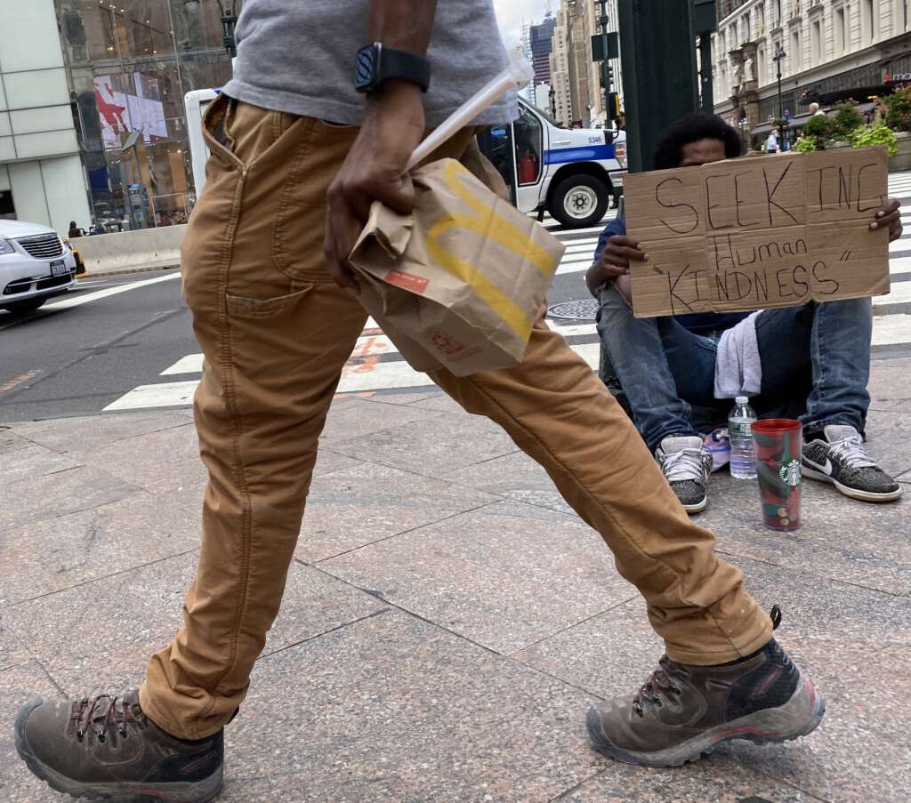
Looking objectively, my eyes were still drawn to the passerby. His stylish hipster pants with the carpenter’s loop and their striking mustard-yellow color were simply too distracting. I want the viewer’s eye to go instinctively to the seated man first. I needed to lessen the distracting color.
Edit #2: Convert to black-and-white.
Entire books have been written about the merits of black and white photography. I’ve always been drawn to the timeless, classic look of black and white photography, and I convert a significant portion of my photos. Whereas documentation requires accurate coloration, black and white may be better for emphasizing mood. It also gives you a lot more leeway when it comes to adjusting tone and contrast. Colors that might look weird and unnatural in a color photo will still look realistic upon conversion to black and white, because you’ve reduced your photo to the basic elements of light and shadow. My goal was pretty straightforward: desaturate those pants so they don’t lead your eye to them immediately. Converting to black and white achieved this easily. It also made the distracting McDonald’s logo on the bag invisible, an added bonus.
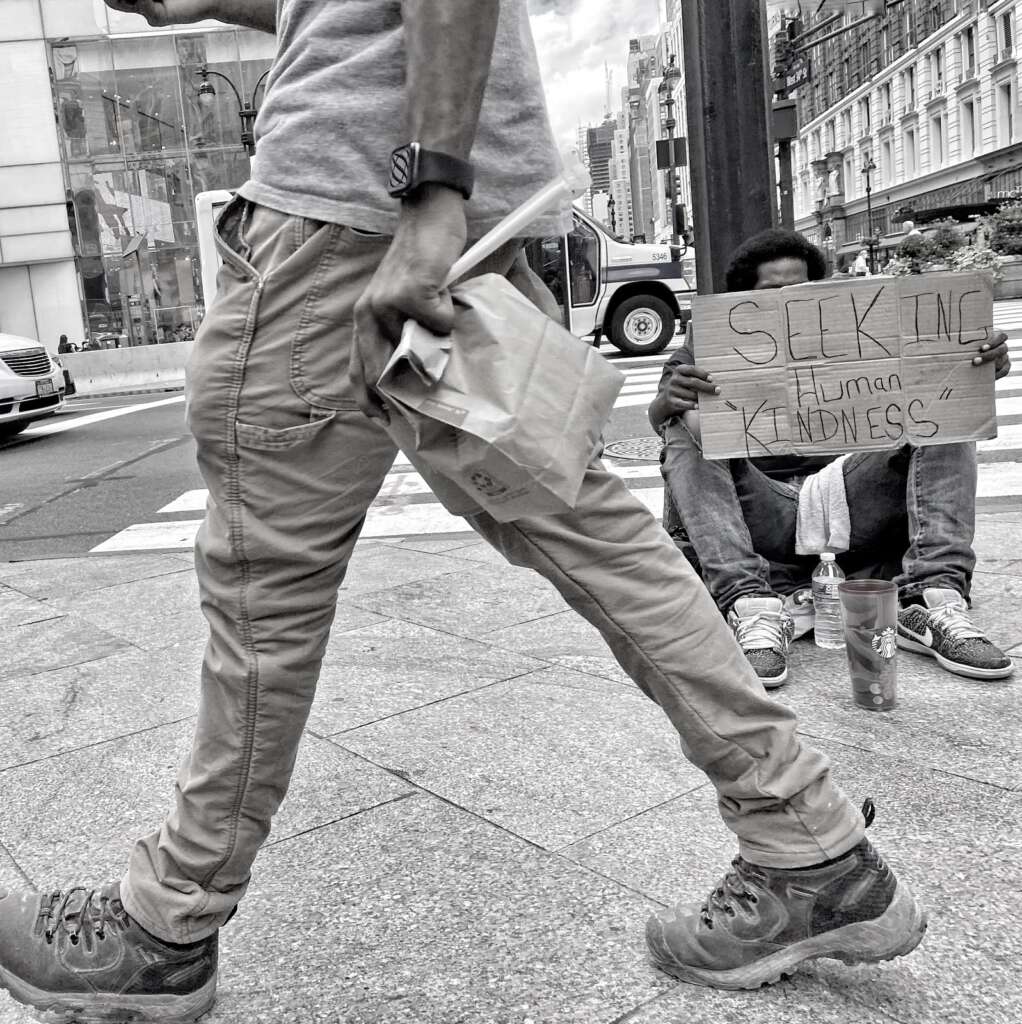
Looking at the photo again, something was still amiss. The passerby continued to dominate the foreground, and he occupied too much of the frame in general.
Edit #3: Crop again.
Cropping has its adherents and its detractors. Many purists believe that the best photographs are those that are composed “in camera”, and that photos should not be tampered with afterward, or that it should be kept to an absolute minimum. Cropping runs the risk of excluding potentially important context, as well as lessening image quality. Cropping reduces pixel numbers, causing the remaining pixels to become larger, effectively lowering image resolution. The very nature of my photograph – unposed, shot quickly from the hip – precluded any “in camera” design and composition. I’m definitely a purist about some things, but as a photographer, I’m a pragmatist; I view cropping as just another tool in the toolbox. I went ahead and cropped out most of the passerby’s front leg.
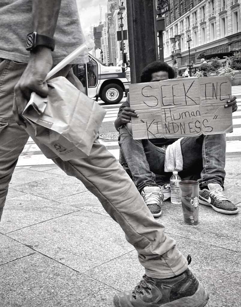
I feel that the second crop markedly improved the photo, visually and thematically. The photo’s message – that our world is too busy to notice a fellow man pleading for help – was amplified by making the seated man the primary point of interest. With the passerby’s presence reduced, he appears even more fleeting, strengthening the theme of man rushing past and ignoring his fellow man.
I adjusted the brightness, contrast, highlights, and shadows to ensure that the message on his sign was as clear and readable as possible, and I was done.
The next day I examined the photo with a fresh set of eyes, and discovered many completely fortuitous things that were cool from both a photographer’s and a viewer’s perspective.
From a photographer’s perspective: A commonly discussed element of photo composition is framing. This refers to using elements in your scene to create a frame within the frame of your photo. In this photo, the passerby’s rear leg and upper body serves to frame the subject on the right. This was unintentional on my part; a happy accident.
Another commonly touted element of composition is the use of leading lines. This technique uses lines (actual or virtual) in a photo to lead your eyes to the main subject in the image. Although it’s not a very prominent feature of this photo, the diagonal lines above and below the white area on the building on the right lead your eyes toward the seated man’s head. Again, this was totally unplanned.
Looking at the photo as a viewer and as the photographer, there are other things in the photo that I appreciate. I like how the passerby is positioned in front of the subject, while a sliver of car is visible behind the subject. To me, it shows that he’s not just being ignored by people walking by, but by the world in general, on foot and in vehicles.
The passerby is carrying a bag and wearing a prominent wrist watch. To me, this underscores the message that the world is composed of “haves” and “have-nots”. The passerby has his bag of food and his fancy watch, highlighting his role of the “have” in this photo.
A commanding element of this photo is the message on the sign. Sadly, homelessness in New York City is rampant. Most of the cardboard signs I ask for something tangible like money or food. Some are more general, such as “homeless veteran” or “need help”. This man’s sign extends beyond that, toward the philosophical. What this man is asking for – human kindness – is something that everyone is capable of offering.
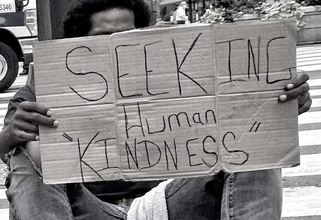
I know as a jaded New Yorker that “kindness” is a euphemism for money, but to the non-jaded, the definition of kindness is expansive: perhaps an opportunity to work, or maybe a temporary place to sleep, or at minimum, even a caring word. The simplicity and purity of what he’s asking for, while hiding unnoticed behind his sign, adds real emotion to this scene.
Finally, I find the most impactful, and the most heartbreaking, feature of this photo is that the subject has deliberately chosen to hide his face. He lets you see his forehead, but he stops right before you can see his eyes. The eyes are the window to the soul, and he does not want to let you in; he is too ashamed. If his face was visible, he’d be just another homeless guy struggling on the streets of New York. With his face obscured, he embodies every homeless person on the street. With the passerby’s face also not visible, he personifies every callous citizen that can’t be bothered to acknowledge the existence of the downtrodden. In fact, there’s not one distinguishable face in the entire photo; the image is completely devoid of humanity. Another unplanned accident to my benefit.
The photographer Luc Kordas said that he likes street photography because on any given day, you have the opportunity to take the best photo of your life. I understand what he means. I can’t say that this is my best photo, but it’s certainly one of my favorites, and one that I’m proud of.
A few days after I took this photo, I went back to that street corner to see if the man was still there. Alas, he was gone. I go to Bryant Park once or twice a week. I will make sure to walk past that corner every time, and this time, I will show him some of the human kindness that he’s seeking.
Epilogue
Yesterday, on my way to Bryant Park, I passed that corner again, and the man was there.
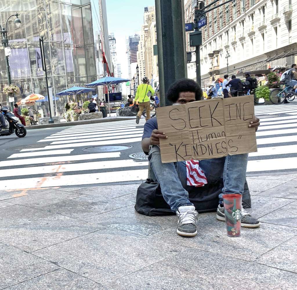
I put $5 in his cup and asked how he was doing. He said, “Okay. Thanks.” I left it at that.

1 Comment
Elliot
Beautiful photography. You seem to be a natural at putting together and processing images.