
First time using the Ricoh GR III
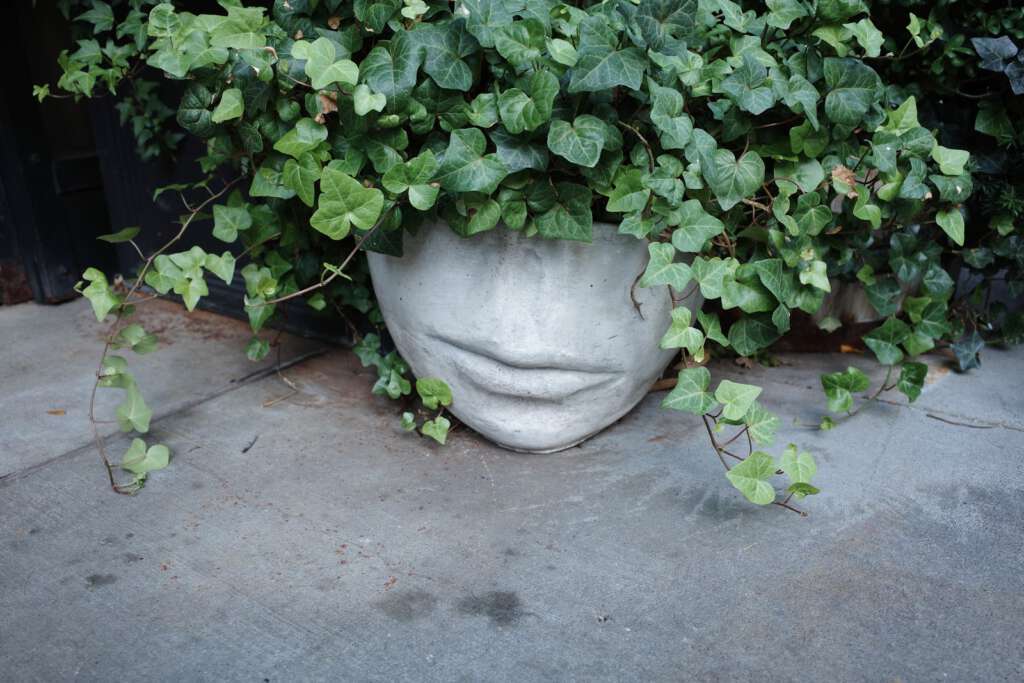
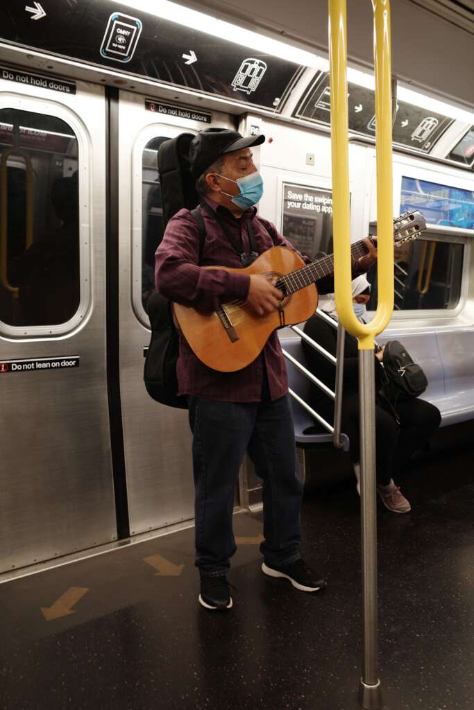
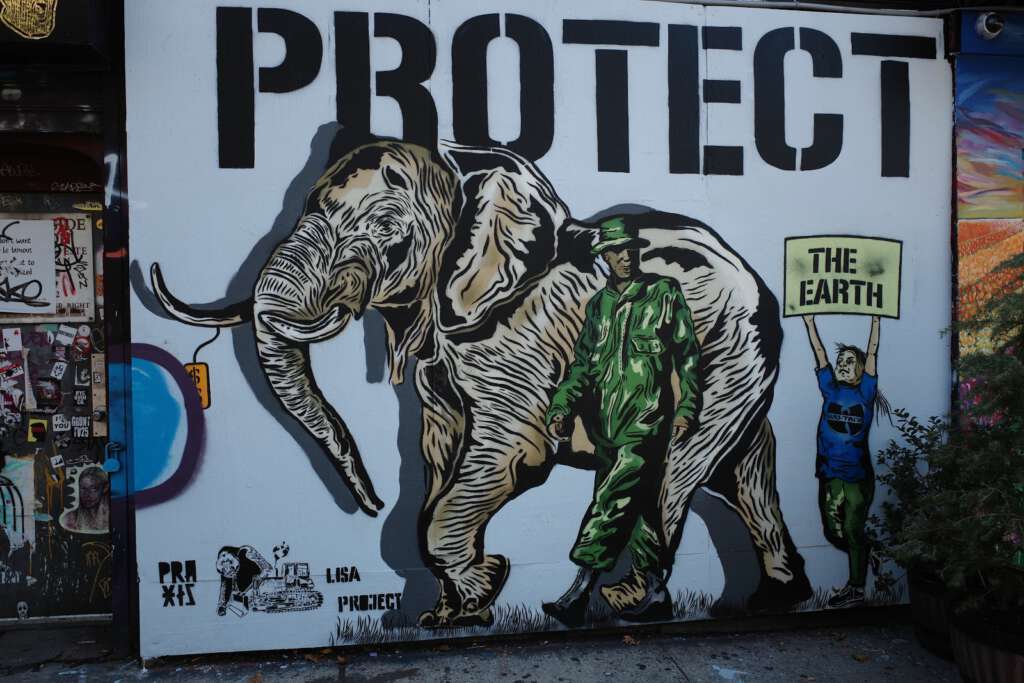
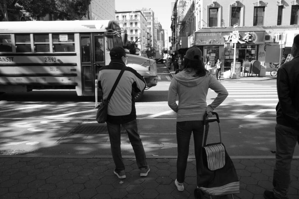
After I purchased the Ricoh GR III it rained heavily for two days straight, preventing me from going out and taking my first photos. On the third day, it was beautiful and sunny, so I headed to Chinatown and the Lower East Side, two neighborhoods with a lot of character.
My initial camera settings for that day were:
- Single frame shooting
- Image stabilization on
- Auto-area focusing
- Automatic white balance
- Metering set to multi-segment (exposure is metered in multiple areas of the frame)
- Positive Film image setting
- JPEG
Here are the very first pictures I took with the camera
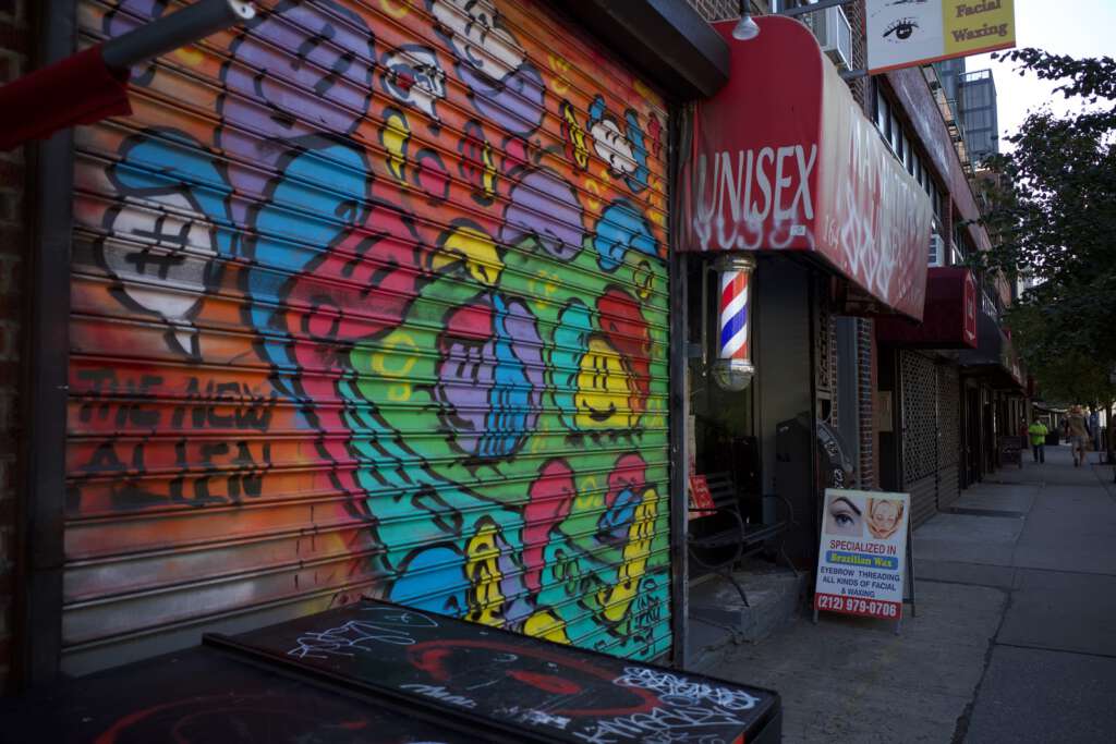
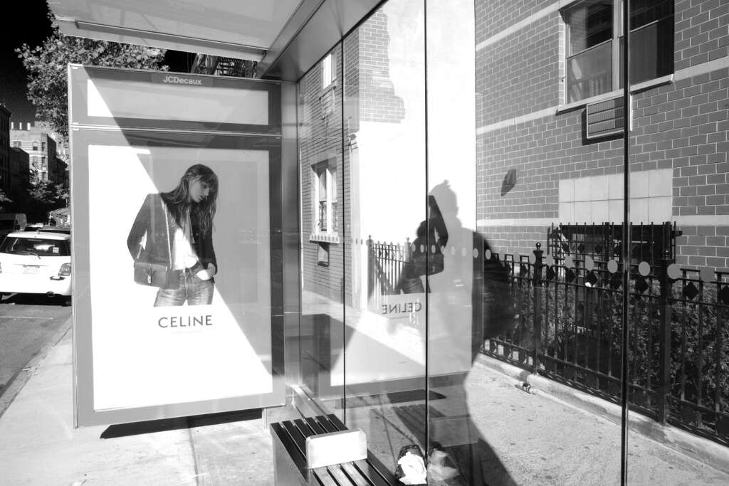
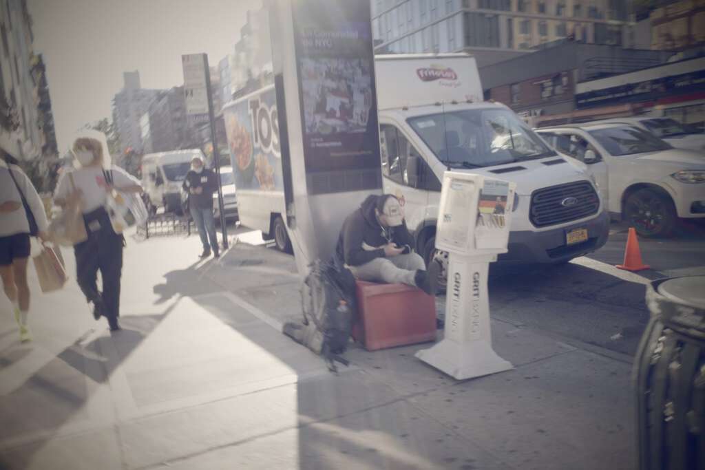
I like the way colors appear, but I forgot about the exposure compensation dial, which I should have used on the last two pictures; I think they’re a little underexposed. I love the way colors look on the Posi (positive film) setting. This setting is supposed to simulate slide film, with more vivid colors. The red, white and blue of the barber’s pole in the last picture seem very accurate to me.
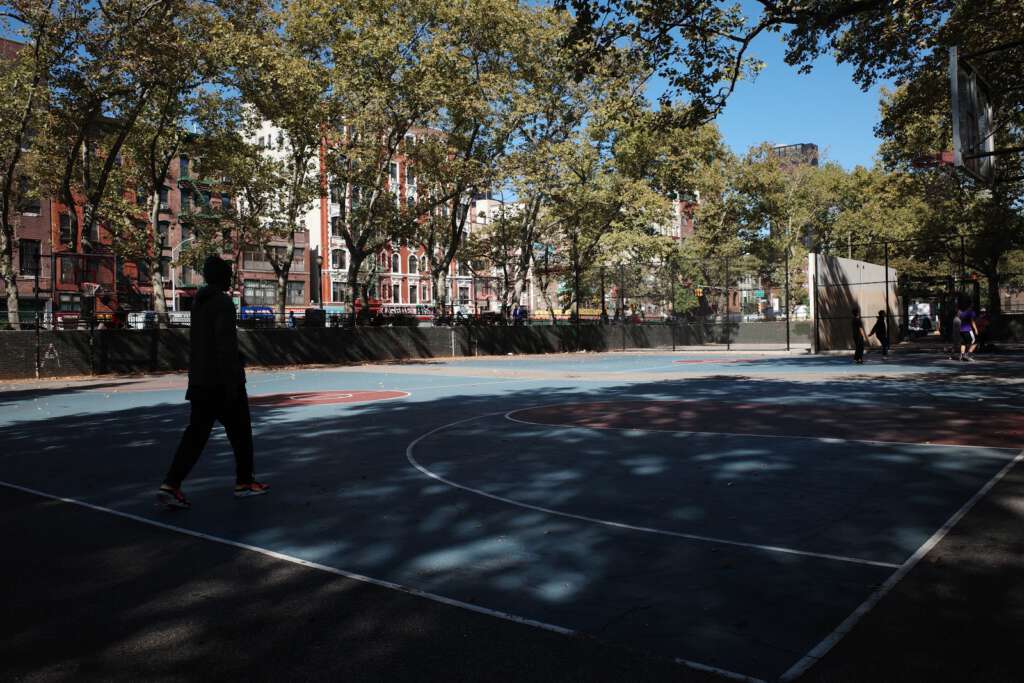
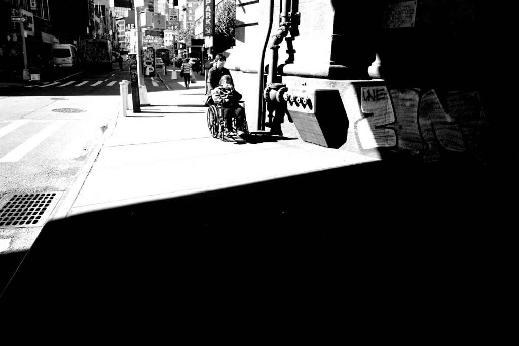
The next three photos were taken with the metering set on “highlight-weighted”. What exactly is highlight-weighted metering? Instead of looking at specific areas like the center of the frame or the focus point of the frame and then using those as the basis for setting the exposure, highlight-weighted metering looks at the brightest areas of a scene and bases the exposure on that bright area. The advantages of this is that it ensures that the brightest portions of the photo aren’t overexposed. However, it also means that a fair amount of the photo is going to be shrouded in darkness, perhaps even too dark and underexposed to be usable.
In the first photo below, the sky trees, and buildings are nicely exposed, but the court and the person on it are very dark. Aesthetics are based a lot on personal taste, and some people find the dark areas to be moody and compelling.
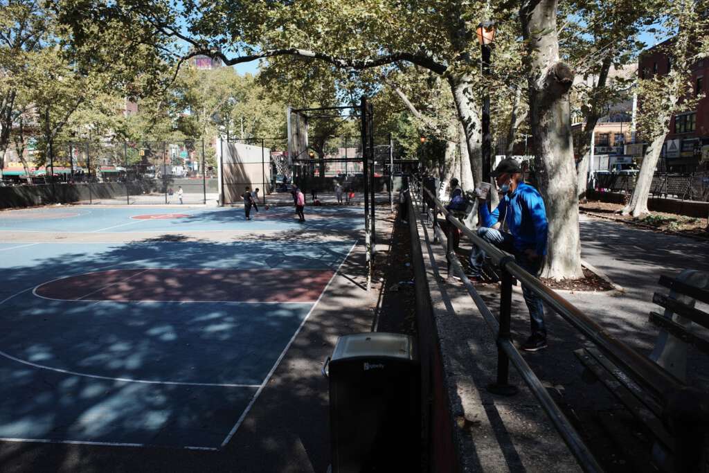
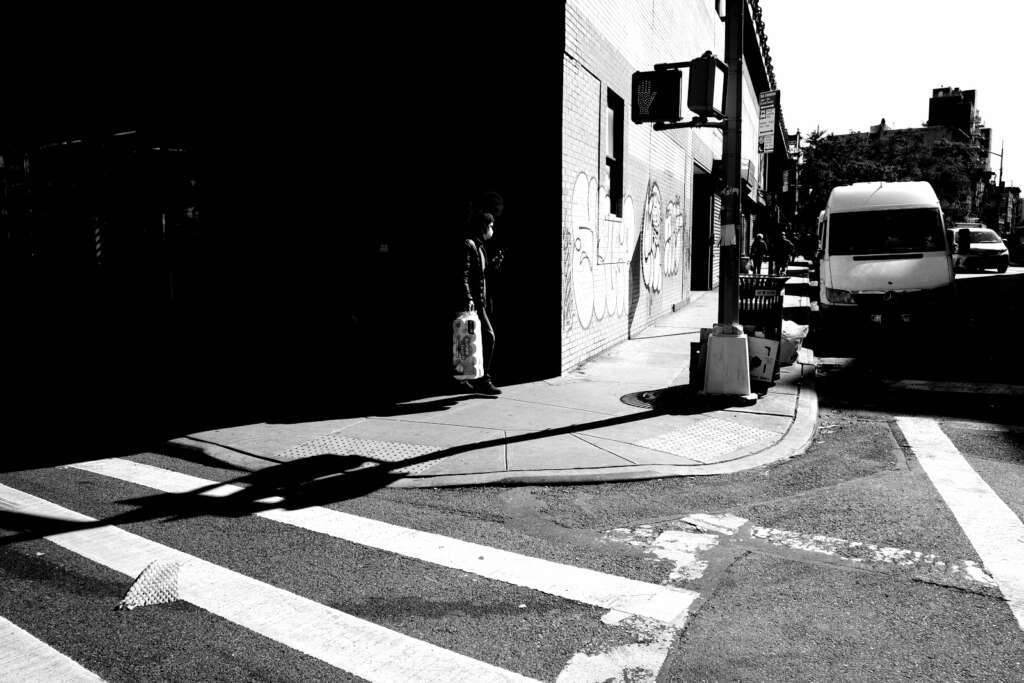
In the second photo, the trash can at the bottom center and the bench at the lower right are underexposed.
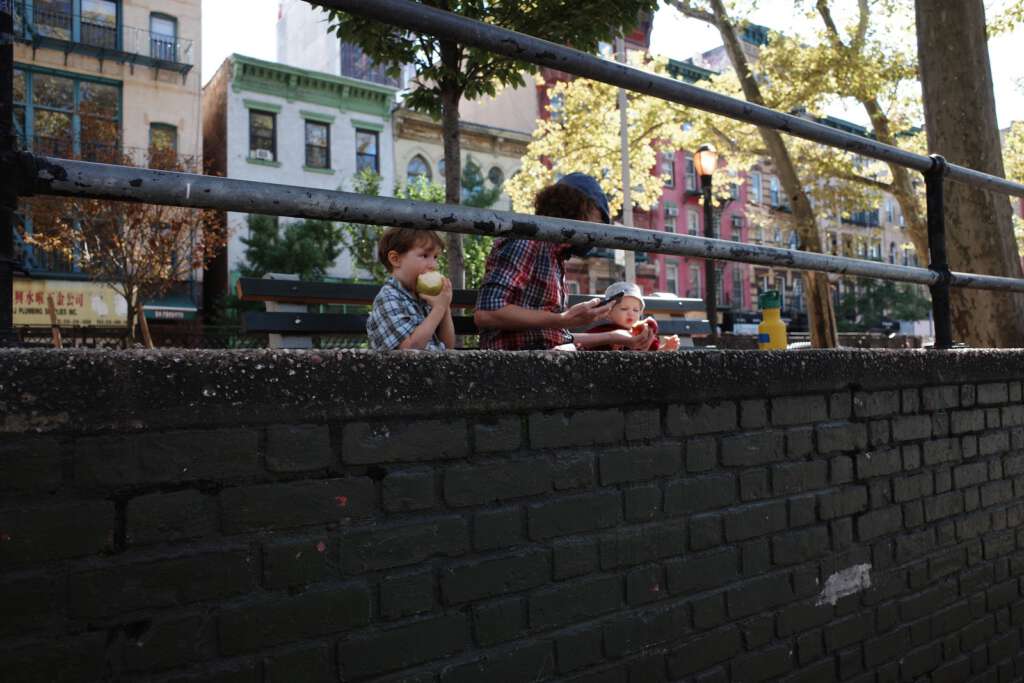
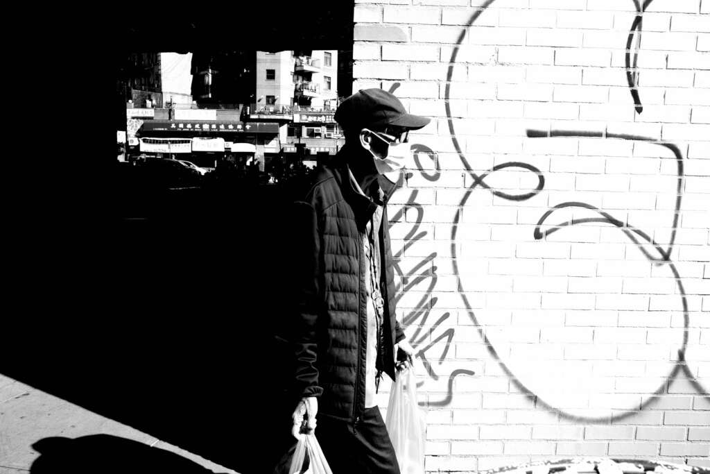
In the last photo, some people might argue that the wall is underexposed. I’m fine with the exposure. I’m annoyed that it looks a bit out of focus. Grrrr.
I have read a bit more on highlight-weighted metering since taking these photos, and apparently there’s no significant advantage of using it unless you’re shooting RAW, which I don’t do. RAW files give you a lot more flexibility to brighten up those dark areas in the post-production phase because all of the data in those dark areas are preserved. I don’t use RAW files because they’re huge and will take up enormous space on my hard drive, and I don’t use editing programs like Lightroom or other programs that are especially proficient for RAW files. I shoot in JPEG, which doesn’t give me as much room to edit my photos in post-production compared to RAW, but is still very good, and is the most popular file type.
The simpler thing to do would be to just use the “exposure compensation” button on the camera and brighten up photos that look underexposed, and darken the exposure in photos that look overexposed. The disadvantage of this approach is that it’s a two-step process. You have to spend a few seconds adjusting the exposure using the exposure compensation button, as opposed to just pointing and shooting using the highlight-weighted metering setting. Is this important in street photography? Theoretically, it can be, if those extra seconds cause you to miss the “decisive moment”. I’m not going to use the highlight-weighted metering, as I don’t shoot in RAW. I will use the exposure compensation button and take my chances.
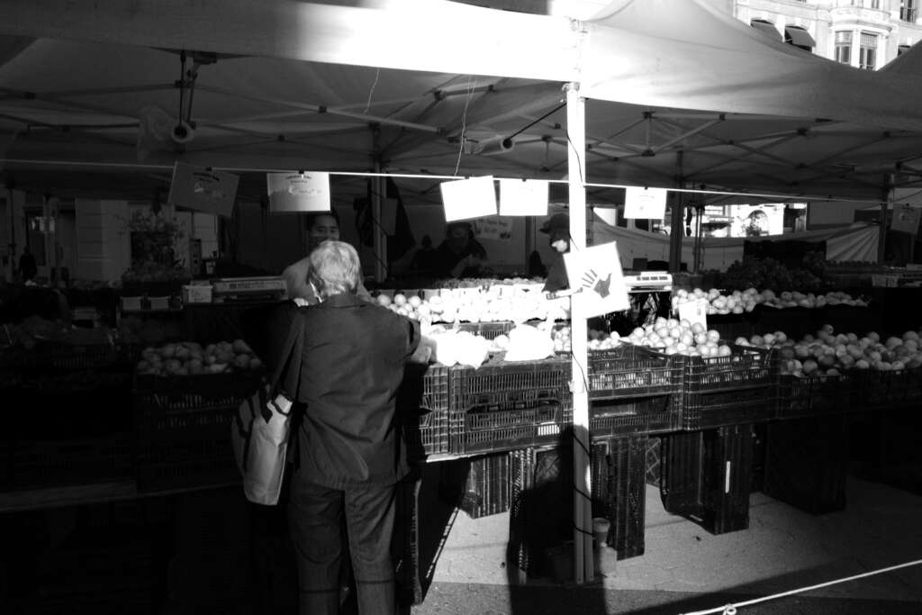
As I mentioned in a recent blog post, this camera has four black-and-white settings that street photographers find very appealing. So, for the next few photos, I went back to multi-segmented metering, but switched the image setting from Positive Film to black-and-white monotone. Keep in mind that it was a very bright and sunny day, which poses its own challenges in terms of exposure, but the BW mono setting did deliver nice looking pics.
The next four photos were shot using the BW soft monotone setting. The shadows aren’t as dark. It has a softer, more faded feel. I am personally not enamored with this setting. It might be good on a misty, foggy day, to emphasize a hazy feel, but for a sunny day, I thought it made things look a little washed out.
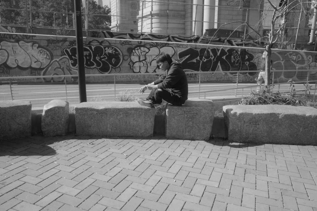
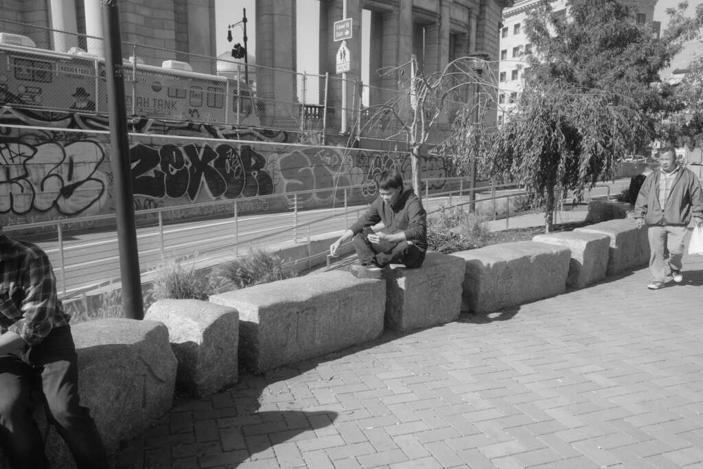
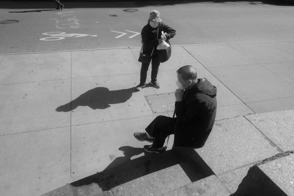
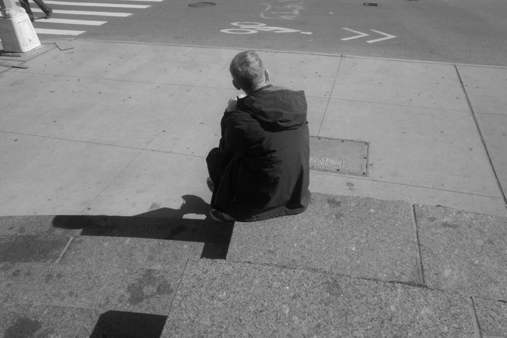
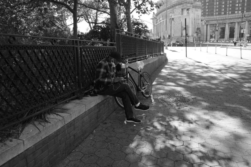
I thought that this man sitting on the step in bright sunlight would be a good subject to compare all of the BW modes directly. So I took four photos additional of him, at each of the black-and-white settings.
To get a good idea of the differences, look at the shadow that he casts on the seat, to his left, to compare the dark shades, and look at the white panel of the pole in the upper left corner, to see how the white shades differ. So, in order, you‘ll see BW mono, BW soft, BW hard, and BW high-contrast.
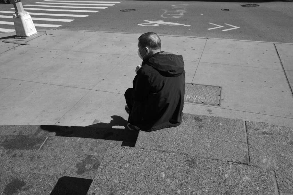
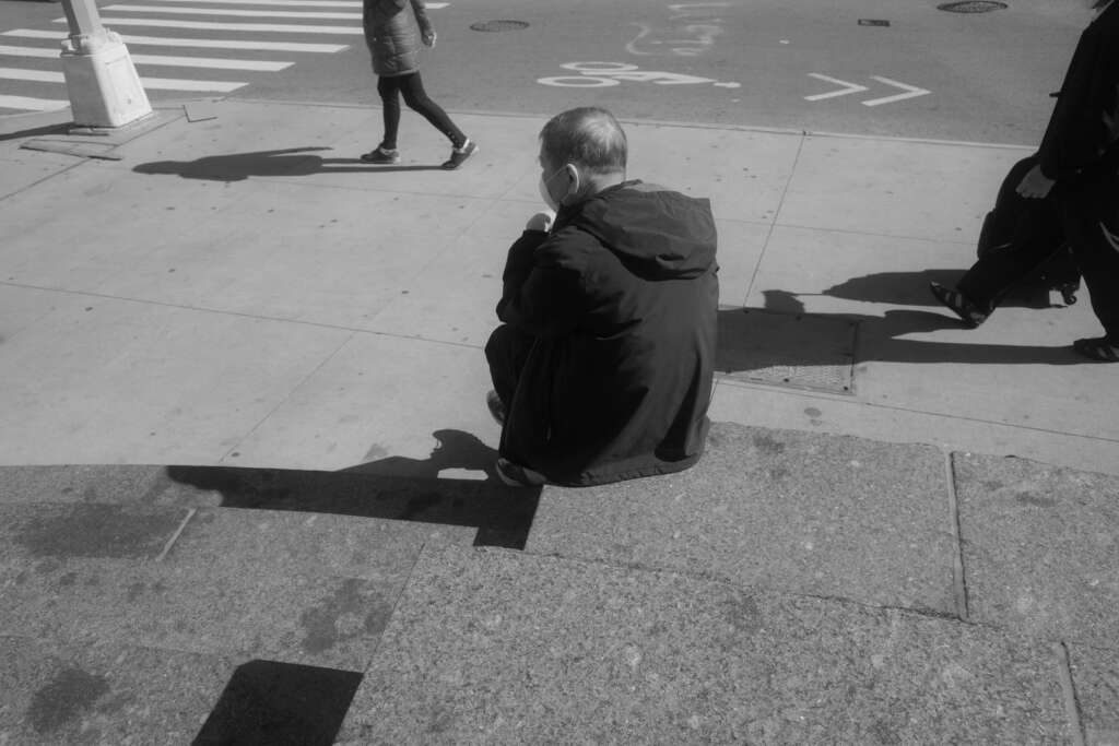
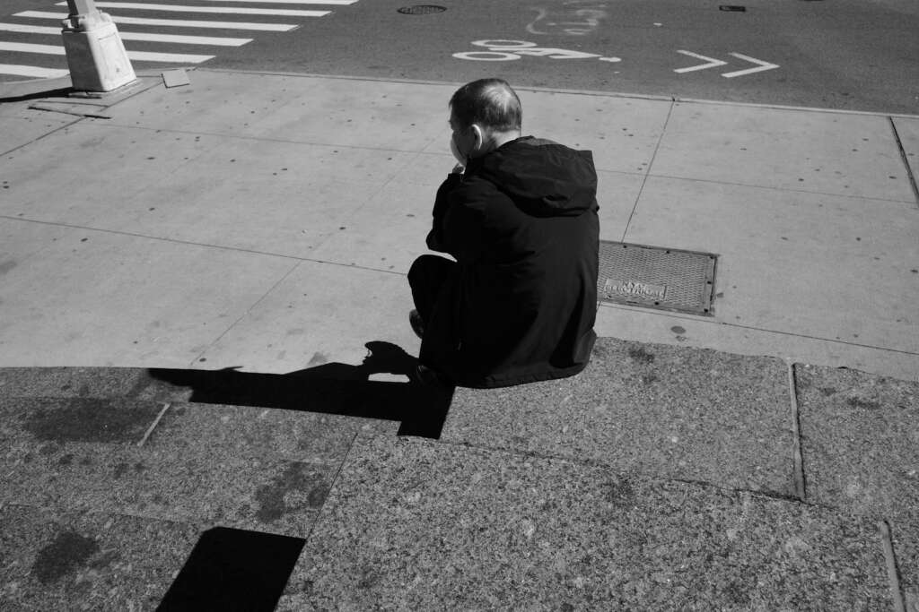
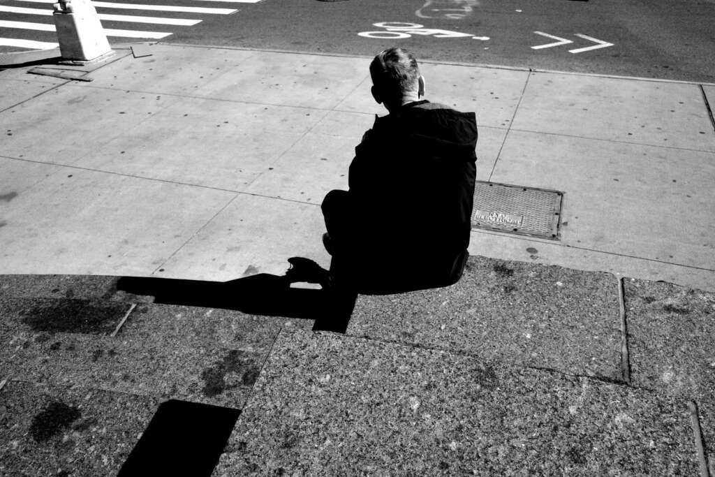
On the slab where this man is sitting, there are some dark spots that look like oil stains. Take a good look at the shadow that the guy is casting, immediately to his left. On the black and white monotone setting you can see, within his shadow, one of the stains. In the next photo, BW soft, you can see it more clearly because the shadow is lighter. On the last two shots, you can’t see the stain within the shadow. The shadows are too dark.
I waver between which BW look I prefer. I like the regular BW monotone look, but I do think the BW hard monotone is really striking. In fact, the next photos are taken using the BW hard monotone setting.
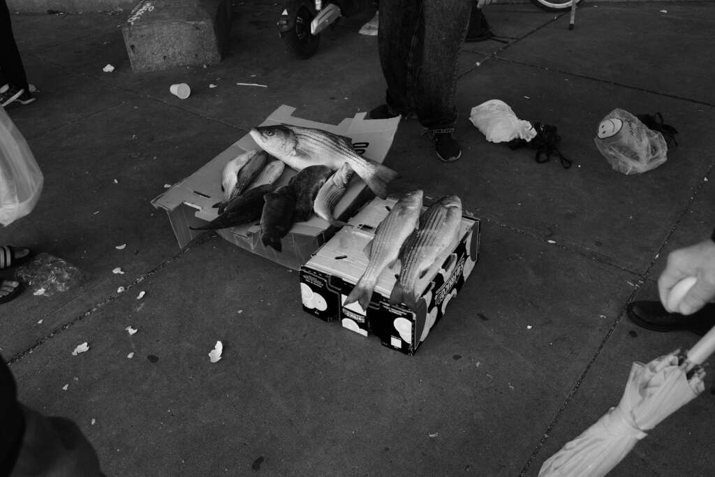
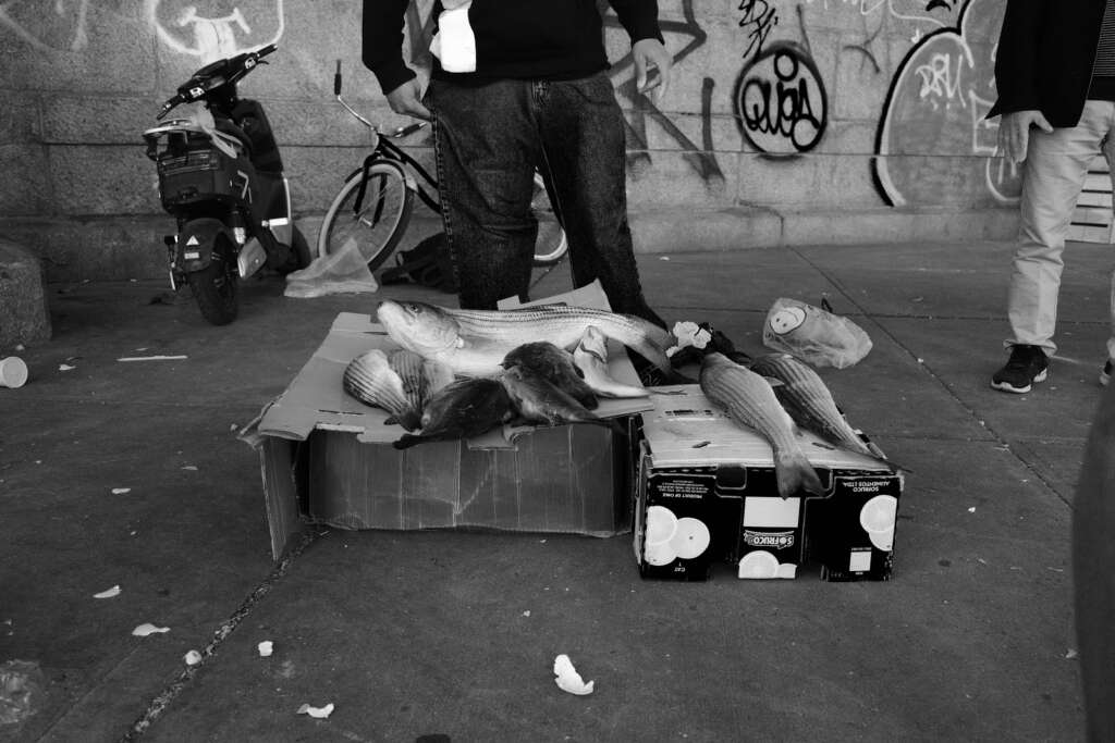
The only complaint I have with the BW hard monotone is that the blacks are very dark and can overwhelm the photo. For example, look at the first two photos of the fish. They look great and are very striking, but the box on the right, with the two fish laying on it, is very dark in the front, and I think the strong contrast detracts from the fish.
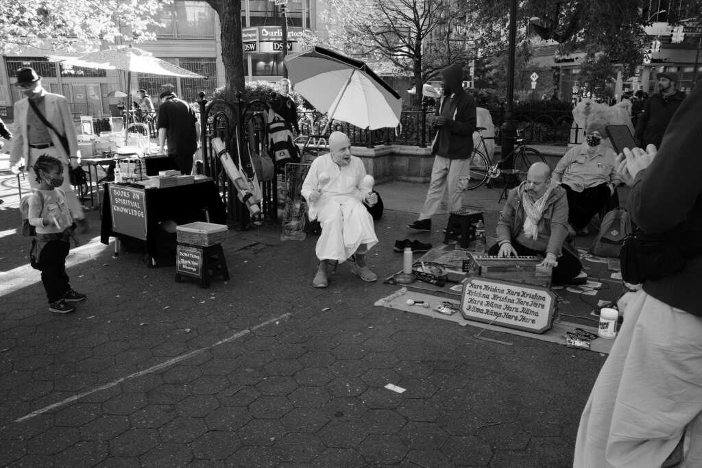
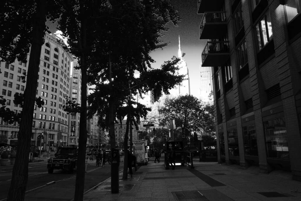
The next few photos I took were using the high contrast black-and-white setting. Many of the street photographers that have posted YouTube videos about this camera LOVE this setting the most. It delivers VERY striking, high contrast images that are artistic and eye-catching. I can’t see using it for everyday shots, but in situations where there is already some striking light-dark shadowplay going on, this setting really nails it. See for yourself, below:
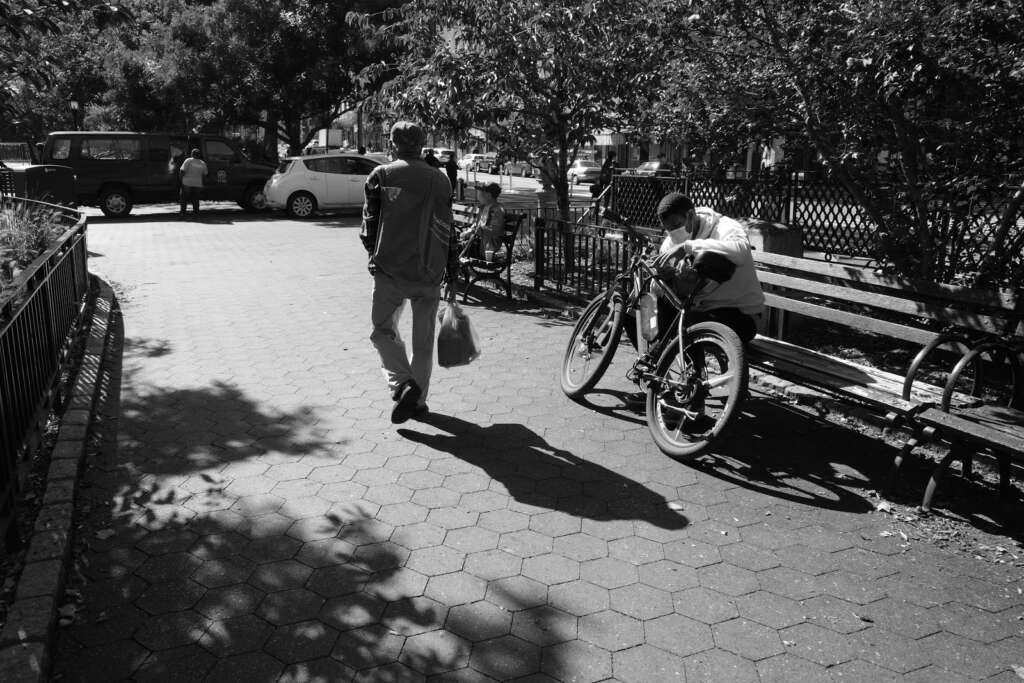
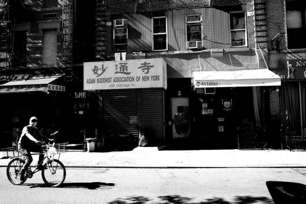
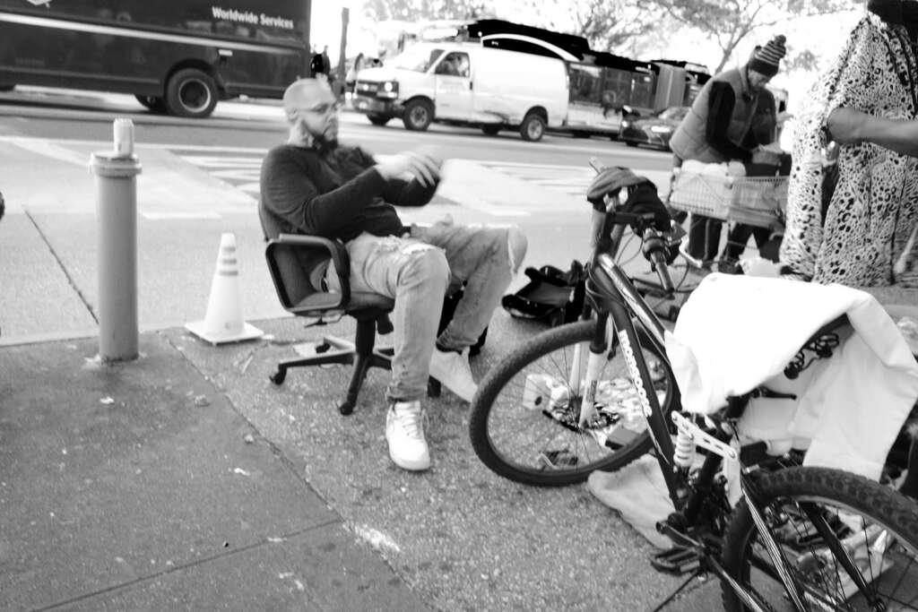
The last photo (below), of the guy on the bike in front of the Asian Buddhist Association, looks great with this setting. This was possibly my favorite photo of the day. So this setting certainly does have its place. It’s pretty extreme, but I do see the appeal.
After these few photos, I just finished out the day, shooting until the battery died, which occurred after 160 photos. I read that typically, the battery lasts for about 170 photos, so that’s pretty accurate. I have since purchased extra batteries to have with me, because 170 isn’t a lot of photos. Below, you can see the various black and white settings, the positive film setting, and one picture taken with the retro setting, which makes it look like it was taken with an old camera.
There’s going to be a learning curve here, as I choose which settings I prefer. I also need to get familiar with speed, aperture, and ISO again, learn how to focus well, and set my exposure properly. About a third of the photos were out of focus today. I need to work on that. Hopefully, in the next few weeks, you’ll be able to see a difference in the quality and style of my photos as I continue to grow and progress as an amateur photographer.

1 Comment
JMat
Just got the Ricoh GR iii. Great article. Do you still like it?